Thursday, January 29, 2009
DESIGN QUESTION...
my newest issue with creating my logos is figuring how to create the look that i want with the software. I'm having trouble achieving a stamp-like appearance with the logo. i plan to work on it in class tonight and post whatever i do in class tonight on my blog. Does anyone have any suggestions for how to create a stamp-like appearance in photoshop or illustrator?
Monday, January 26, 2009
SO EXCITED!
I think i finally have two good ideas for my project and I am so excited to have a solid idea to work from. I think i want to go with a stamp type of look for the logos. I have decided that i will proceed to take on both of the clients for this project because i have good ideas for both of them. My symbol for silvermoon barbershop is going to be a barbershop chair done in line art in photoshop, and the symbol for thelma's rib shack will be a pot, chef's hat, or fork and knife. Each symbol will be place on some type of eroded background to give it a stamped look. I have found some interesting fonts that look eroded, and i will probably end up using them for the names of the businesses in the logos. The color scheme for the barbershop logo is going to be red, white, and blue, and the color scheme for thelma's is going to be a deep red, (reminiscent of barbeque sauce), brown and black. I have already began to think of specialty items i could make for each business. I think a menu for thelma's would be great, and a flyer or price list for silvermoon will be great because they currently do not have one. The next step for me is to begin designing on the computer. I will begin designing on the computer tomorrow in class because i need to scan in some photographs to work from. Wish me luck!
Tuesday, January 20, 2009
SO FRUSTRATED!
I've been working on drawing logos for both of my potential businesses for the past couple of days and I'm frustrated. I want to come up with a logo design that speaks to me. I want to draw it, look at it, and think...yes! This is the one! But so far this has not happened. However, i have to remember that this is part of my design process. I start off excited, then i get frustrated, i worry, i swear and pull my hair, and then one day it just happens! The magical lightbulb finally turns on! Sometimes it happens completely by accident and other times it takes for me to walk away from what I'm working on and return later to look at it with a pair of fresh eyes. We'll see what happens!
Wednesday, January 14, 2009
PROJECT LOGO IDEAS AND CREATIVE BRIEF
I am currently in the process of drawing thumbnails of logos for both of the businesses i picked. Im not sure which business I will choose because i feel like both of them have a lot of potential. The first business is the Silvermoon Barbershop on auburn ave in atlanta. The second is Thelma's Chicken and Rib Shack, which is also on auburn ave. I have creative visions that stuck out immediately to me when i saw these places. For the barbershop i envisioned a classic, old fashioned type of logo. The catch phrase for the barbershop is: "The oldest black barbershop in atlanta." I wanted to use photographs of the barbershop chairs and turn them into line art in photoshop to be part of the logo. However, i also have an idea of a simple picture of the clippers that the barbers use to be part of the logo. The cord that comes from the clippers would be great to use as a design for stationary.
For the second business, (Thelma's Rib Shack) my vision is to simplify it and tone down the existing logo. Instead of using corny images of actual ribs next to the title (which is in the existing logo) I want to use more unexpected images that remind you of an old fashioned, southern kitchen. These images could be pots, forks and spoons, ect. Furthermore, the menu for this restaurant definitely needs to be redone. It is currently a plain piece of white paper with a simple type up of the food items and prices. I feel like this menu and the logo does not do Thelma's justice. This is a kitchen that has been around for 35 years. It is family owned, and the food is truly some of the best home-cooked southern BBQ you will ever taste. The people who work here are so friendly, and the atmosphere is casual and homey. I think that the logo and stationary should reflect the atmosphere of the restaurant.
Im not sure which of the two businesses i will choose. i will continue to sketch thumbnails of logos for both businesses and see which one i have the most fun with. I will also see which one i have the most creative ideas for. Perhaps then i will be able to choose. As soon as i get a chance i will post pictures of the thumbnails i am creating.
Friday, January 9, 2009
PAST PROJECTS
I have posted some projects that i worked on in previous graphic design classes. Some of them i love, and some of them need some reworking. Feel free to tell me what you think about them! constructive criticism is welcome!
GOOD AND BAD LOGOS
here are some examples of logos that i think are good and bad. I have explained why under each picture...feel free to comment!
Subscribe to:
Posts (Atom)
FINAL LOGO-SILVERMOON

Here is the final logo I've created. I think I will end up going with the blue one for the color version because i think it looks more sleek and will look better on a black background.
LOGO'S IN PROGRESS

here are some logo's I've done for silvermoon barbershop. I've done black and white as well as color versions...but the colors are probably going to be changed.

here is the second set I've designed. I think i like the logo thats in the middle of the right column. I think i will continue to develop this one to turn in.
logo sketches

these are the first logo ideas i sketched for silvermoon barbershop. I dont like any of them. For some reason these pictures came out darker than i expected.

second set of logos for silvermoon barbershop....i still dont like them

now I'm beginning to like them a little. The pictures are still coming out too dark

i love these four logos!

These are the sketches I've come up with for thelma's rib shack...i like these

i like these logos also
POTENTIAL CLIENTS FOR REBRANDING-thema's rib shack

does this place need some rebranding or what?


wow,,,a picture of cartoon ribs? welcome to cornytown. lol

POTENTIAL CLIENT 2-silvermoon barbershop

i just think this logo could be better


i think this chair would look so cool as part of the logo

these clippers could also be part of the logo


bad logo 1
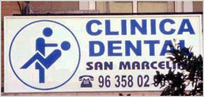
this logo is bad for obvious reasons. The image of a dentist and his patient looks more sexual than professional
bad logo 2

This logo is bad because it is very confusing. Vertical text is always harder to work with and it seems forced in the position its in. I think it would have been easier to read above or below the image. Furthermore, this logo has a very familiar nike check through the middle. It is too similar to the nike logo and looks unoriginal.
bad logo 3

I do not like this logo because once again, i feel that it's too busy. The brush-like font is not one of my favorites, and the drop shadow behind the words combined with the stroke around the letters makes it feel too "cartoony." I personally don't think the scissors are even necessary.
bad logo 4

okay first of all....i don't like this color scheme. I think this logo does not work because the three different typefaces feel busy. I think one or two would have been enough. The three organizations written inside of the border feel forced inside if the circle. Some of the words seem to be in italic and some do not. Over all i think there is just too much going on.
bad logo 5

wow...all i can say is welcome to cornytown. lol an engine with a face? how corny is that?
good logo 1

i think baby phat is a great logo. The cat sybol has become very iconic and can stand alone without the text and people still know what it represents. The simple, elegant, and sexy design is a perfect representation of the company. This logo is so popular that i have actually seen people with tattoos of it. Less is always more when it comes to logo design.
good logo 2

i think the gucci logo is great because it is also iconic. It can stand alone as a symbol or with the actual name. very simple and elegant.
good logo 3
i know this is a pretty common logo, but i think everyone can agree that apple has one of the best logos in the world. Their logo is very iconic an easily recognizable. Furthermore Apple's package design is just awesome. Their apple logo has gone through some revision over time, and i really think that now it's the best it could ever be.
good logo 4
I think bellsouth has a very sucsessful logo. The bell can stand by itself with out the name of the company. Very simple and straight forward.
good logo 5
i love MTV's logo. I think it captures both the professional and raw, unscripted footage that is shown on the channel. I also think this logo depicts the energy of the channel.
PROJECT 1 part 1

this is one part of an ad project i did in my first graphic design class. The assignment was to find different elements from magazines, cut them out, and arrange them in photoshop to create an ad. None of the elements of these projects go together. The project was only about composition, unity, and colors scheme. There are three parts to this project b/c i had to create three different size ads that all went together.
PROJECT 1 part 2

PROJECT 1 part 3

PAST DRAWINGS

all i can say is anyone who's ever taken paul rodecker's class will know what this is...intercross is a pain in the you know what! lol but i does help you to understand form better when you draw. It teaches you perspective and that objects are not always shaped the way you may think they are
PROJECT 2

this is a book cover i designed for the novel ROOTS by Alex Haley. The assignment was to choose a classic novel and re-do the cover. The photography on the cover is all original. This cover went through many revisions b/c i had a hard time staying away from typical images of slavery, (which is what the novel is about). The final product is what i feel is a more modern approach to images of slavery.
PROJECT 3-personal logo

this is a design of my personal logo. The colors in this project are incorrect on the screen. The top one is in black and white and the bottom two are in color. The color version is supposed to be black and lime green, not this funny blue color that appears on screen. The logo is obviously my initials, which are b, a. When designing this logo i was trying to go for a simple, sleek look that would look like a logo you'd see in fashion. Perhaps on sunglasses or purses. I wanted to keep it simple so that it could be easily recognizable. However, i feel that i could push this logo a little further. I plan to redo it for my portfolio in the near future.
PROJECT 4-package design

For this project i had to redesign an existing hardware package. I choose a package of craftsman heavy duty staples. The original package is hideous! I will try to post a picture of it as soon as i can find the usb cord to my camera. lol The original package had a harsh black and red color scheme, the craftsman logo was in an ugly blocky text, and it just didnt seem like an appealing package design to me. I wanted to turn it into something that would stand out in a hardware store....something more unexpected. I wanted to simplify the design and make it more easy to read. Furthermore, i wanted to make it more gender friendly (if thats even a word) lol. As a woman, i personally feel that hardware packaging is made to appeal to "manly men" who could care less about design. I wanted to also make the package appeal to women, because hey, we women like to fix things too! lol

this is a self portrait of my eye. I did a very close up study of it and i used lines to show value and form.

this is a self portrait. i really wanted to study the form of my face, the way the bones are structured ect.

this is another self portrait. I dont think it looks exactly like me but i still think its pretty cool.

this is a charcoal drawing of a still life. i love the values that you get when using charcoal.

this is another charcoal drawing of a still life.

this is a self portrait. This is the one i feel looks the most like me...except i promise i dont look this evil everyday. lol

this is a study of texture. i literally went through buildings at my school and rubbed charcoal and paper against all types of surfaces.
