Sunday, April 26, 2009
REFLECTIONS
Well, our journey has finally come to an end this year. Our class has been challenging and extremely entertaining. Sometimes its sad to think of something good ending, but i like to think of it as the beginning of something better. This semester in Stan's class was great. Everyone is all so talented and different in there design styles. I wish everyone the best with getting into the program, and one way or another, I look forward to seeing all of you again next year. Have a great summer, work hard, and remember to play even harder lol.
Saturday, April 25, 2009
REVISED FULL PAGE AD
 Ok everyone, i am currently in the process of redoing my ads for silvermoon barbershop. Here is my finished version of the full page ad. I've taken better pictures of the men I've decided to use, and I've decided to use a black background to give the ads a more sleek/sophisticated look. Instead of changing the background colors and using rays in the bacground, I've decided to change the color of the tagline at the top of each ad as well as the dotted line to give the ad a little playfulness. What do you think of this idea?
Friday, April 24, 2009
THOUGHTS
So today I'm really hoping that everything will go as planned. when i get off work today i plan to spend the next few hours in the aquarium. I really would like to get four more projects printed today. I hope the line to print is not long. Im a little worried but I'm also excited to see all of my work boarded up and in my portfolio box. I feel like I've worked very hard this past year, and having all of my work in one place to show off is going to be very rewarding.
Thursday, April 23, 2009
SPECIALTY PIECE

This is the specialty piece I've designed. These are sleeves that will go over a shaving kit. I have designed it in three different color schemes so that it can be a series for different types of kits. The blue sleeve is the main one that will be around the kit I'm showing. There are two issues I'm running into. The first is that I either need to find some colored tissue paper to stuff inside of the existing box i have for the kit, or i need a new box altogether. I've also realized that the paper i have to print my sleeve on is smaller than the actual size of the sleeve, which means i either need to print it out in pieces and put it together, or i need a smaller box so that i can design the sleeve smaller. This really sucks right now because my car is in bad shape, and now i have to find someone to take me to walgreens and sam flax. I cant wait until all of this is over....count down to May 1st!
EARTH DAY POSTER

Okay, so here is my earth day poster. I really like the simplicity of this poster and i love the image I've used. What do you think? Is it too simple? I did not want to over do it with the type because i wanted the image and the words: saving earth to be emphasized. Any comments? Constructive criticism?
Monday, April 20, 2009
PROGRESS
Today i actually got a little work done! I've printed out some of my projects for my portfolio and i got my shaving kit today at walmart. It was kinda pricey considering everything i still need to buy for my portfolio (paper, portfolio box, and a few more boards). I plan to scan the existing sleeve and redesign it. So therefore i cant start designing until i get to scan it tomorrow.
Im also beginning to redesign my calendar that i did in typography class last semester. I have a great concept and i cant wait to see how it comes out. For now, i gotta get back to work. So ill let ya know what progress i make in class tomorrow.
Oh and the finale for Ray Jay's show is on tonight....i cant wait to see who wins!
Sunday, April 19, 2009
ANOTHER SPECIALTY ITEM IDEA
so, i've been thinking alot and i hope im not getting ahead of myself. I still want to design a sleeve for a grooming/shaving kit. However, I've also been thinking of doing t-shirts. My t-shirts could be comical, perhaps it could show some images of people with bad hair cuts on one side, and then the other side could have the logo and the slogan, "Saving people from bad hair since...whatever date the shop originated. This is just an idea...what do you think?
Also, if i designed a t-shirt, how would i get it printed? Any ideas?
EXAMPLES OF GOOD PACKAGE DESIGN


These are some great examples i found on the internet of package design. I think that package design is very interesting because it really influences wether a consumer will buy a product or not. A great look can even sell a crappy product. I especially like the idea of designing wine bottle packaging. I'm kind of excited about doing that project once i get into the graphic design program at georgia state.
ONE HELL OF A WEEK
All i can say is wow, this week has really been something. I had to have surgery this past wednesday and i sure didn't see this medical emergency coming. I've been in pain all week from healing and I'm finally starting to feel somewhat better in terms of being able to walk for a long period of time. Between being bedridden, high on pain killers, and being stuck at home with my mom to recover, I haven't been able to get any work done this week. I'm behind in 3 of my classes and I have a crap load of work to catch up on. Im so stressed, because my graphic design projects will take the most time to catch up on. Not to mention the fact that i need to get more of my projects printed for my portfolio before the digital aquarium becomes a war zone. So wish me luck, I gotta do what i gotta do! I will be in class this tuesday.
Thursday, April 9, 2009
SPECIALTY PEICE IDEAS
For my specialty piece i know exactly what i want to do. I want to design a sleeve to go around a shaving/grooming kit. The first step is for me to find a shaving kit and buy it so i'll know what kind of shape im working with. Also, my second idea would be to design a pamphlet with some information about that barbershop. Out of the two of these ideas i like the shaving kit the most. so wish me luck on finding a shaving kit that isn't too expensive!
Sunday, April 5, 2009
INTERESTING TYPOGRAPHY
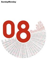
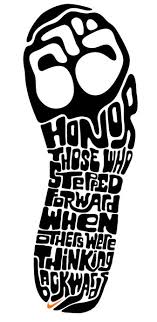


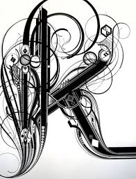
Okay, so here are some interesting pieces of typography that i found online. I think they are all beautiful in different ways and i would love to create some interesting type projects like these. I think that part of being a good designer is knowing how to use type in a clever way. Sometimes relying on images can be a downfall if you cannot find/create an image that fits the message you want to portray. When this happens, its good to know how to use type as an image. This is something i would like to continue to work on in the future.
Friday, April 3, 2009
INSPIRATIONAL POEMS
Although i can write poetry myself, i found a very nice poem called DON'T QUIT that i thought would be nice to share with my fellow classmates. I know that we all have our times of frustration and wanting to give up when it comes to college and our career as graphic designers, and i thought that this poem would be a few words of encouragement. Hope you enjoy!
Don't Quit (author unknown):
when things go wrong as they sometimes will,
when the road you're trudging seems all uphill;
when funds are low, and the debts are high;
and you want to smile, but you have to sigh;
when care is pressing you down a bit;
rest if you must but don't you quit;
Success is failure turned inside out;
The silver tint of the clouds of doubt;
and you can never tell how close you are;
It may be near when it seems afar.
So, stick to the fight when you're hardest hit-
It's when things go wrong that you mustn't quit.
Tuesday, March 31, 2009
1/4 PAGE AD

Here is the final 1/4th page ad ive done for silvermoon barbershop. I've also refined the largest ad and fixed the issue with the different exposures in the pictures. I LOVE MY ADS!
Sunday, March 29, 2009
ADVICE FOR CARTOONING
Here is a quote from a guy named Frank King that was published in a book in 1926 called HOW TO BE A CARTOONIST by Clare Briggs. I thought this quote would be helpful to anyone interested in cartooning.
AD PROGRESS

 These are the full and half page ads ive done in class so far. i love them and im very proud of them. I still have to clean the full page ad up a little more. I have also done my smallest ad, but im having a little trouble getting it on the blog. ill get it up tomorrow.
Thursday, March 26, 2009
MY BIRTHDAY
HAPPY BIRTHDAY TO ME! HAPPY BIRTHDAY TO ME! HAPPY BIRTHDAY DEAR BRANDI, HAPPY BIRTHDAY TO ME! AND MANY MORE!
Today is my birthday and I'm so excited because I'm 21 now. Im really looking forward o going out and having a great time this weekend. but first, i have to catch up on some work in class.
Sunday, March 22, 2009
WORK IN PROGRESS
okay...so this week has been a little busy for me. As of now i have not had time to get on photoshop and edit all of the pictures i want to use in my ads. However, i do have a solid idea of what i want to do. I am thinking of going along the lines of the idea that stan suggested on the class blogsite. i have taken pictures of different men's haircuts (different ethnic groups) and i intend to use them in the ads to make silvermoon more diverse. I was planning on using big, bold text with simple taglines to really get the viewers attention. Im really excited about these ads and i cant wait to atleast get one ad finished so i can put it on my blogsite. im aiming to have two out of three ads done by the end of the week.
Monday, March 16, 2009
STATIONARY PRINTOUT
 This is the final stationary print out that i will be turning in this tuesday. I am very pleased with the way my stationary design has come out. It's simple, sleek, and says a lot without going overboard. My next challenge will be my ads. My time is running short and i still feel as though i do not have a solid idea to go with. I really like the idea with either drawing heads of different hairstyles or taking photographs of them and using them in my ads. However i also like another idea i have of using a clock to emphasize my catch phrase: "it's time you sat down." Hopefully i can do an example of both and see which one has the bast response.
Wednesday, March 11, 2009
JURIED STUDENT SUBMISSION
 This is a past book cover project that I have entered into the exhibition. It is one of my favorite projects that i have done because I enjoyed this project very much. I hope it makes it into the exhibit!
Wednesday, March 4, 2009
FINAL STATIONARY DESIGN


here is the final design I've come up with for the envelope, card, and letterhead. Im wondering if the chair on the envelope should be taken off because i was going to have the inside of the envelope be the bright blue color to surprise the person opening the letter. I figured this would be a simple, clean way to tie in all the colors with out going overboard with the chair. The only problem is that without the chair on the envelope, I feel it may be too empty and plain. Any suggestions?
THOUGHTS...
Im very excited about submitting my work in the upcoming exhibition. I think that i will submit the bookcover that i designed for ROOTS by Alex Haley. I am really enjoying my spring break right now, but i feel like i cannot completely let loose because i still have so much work to do. I am trying to come up with ideas for my ads as well as finish up on my stationary design. I just hope that i can pull everything together in time so that when i come back from the break i will have some solid ideas to work with.
Monday, February 23, 2009


Sunday, February 22, 2009
FINAL BUSINESS CARD DESIGN...
 This is the final business card design I've decided to go with. Im not sure which color scheme to go with though I'm leaning towards the blue and white design. However I also like the black design b/c it looks sleek. On the black design the logo displayed is not the color i really want it to be. The logo on the black design would have the world silver in grey and the words moon and barbershop in white. It would be displayed the same on the back of the card. Does anyone have any suggestions about which color scheme is best, or if i should go with a different design?
Wednesday, February 18, 2009
MORE BUSINESS CARD DESIGNS

Here are more business cards I've designed in class. Ignore the chairs on the left i was using them to help me think of designs. I want to incorporate the shape of the chair in the logo as an abstract form that will give one side of the card texture.
Tuesday, February 17, 2009
A LOT OF WORK TO BE DONE

This weekend was a good weekend for me because i had the opportunity to go out of town, relax, and forget about everything school related that has had me stressed. However now i really have to buckle down on getting my stationary designs completed. Im currently working on business cards first, here are a few designs I've come up with. The bottom two show front and back and the top is just the front design. I'm not satisfied with the designs I've come up with thus far. Im trying to not worry about the upcoming deadlines, but i know that some stress is inevitable. This weekend i plan to really make time to finish my stationary designs.
Tuesday, February 10, 2009

Sunday, February 8, 2009
MY FINAL LOGO...I LOVE IT!

the process for coming up with my final logo for silvermoon barbershop was a fun and frustrating one. however, just like i said before....the idea would come to me in time. I think that the final logo design I've come up with is exactly what i was looking for. I wanted something that was classic, textured in appearance, simple, and easily recognizable. Now my only decision left is to choose the correct color scheme for the color version. I'm thinking that it will be a plain blue. The next step is for me to come up with a stationary design. I was thinking that I would use shapes and clean, solid blocks of color to give the stationary a sleek, modern feel while still maintaining a classic feel. I do not want the stationary to be too overly decorated. I want to attract male customers to this business, and too much color and frill may give the business the wrong appearance.
Thursday, January 29, 2009
DESIGN QUESTION...
my newest issue with creating my logos is figuring how to create the look that i want with the software. I'm having trouble achieving a stamp-like appearance with the logo. i plan to work on it in class tonight and post whatever i do in class tonight on my blog. Does anyone have any suggestions for how to create a stamp-like appearance in photoshop or illustrator?
Monday, January 26, 2009
SO EXCITED!
I think i finally have two good ideas for my project and I am so excited to have a solid idea to work from. I think i want to go with a stamp type of look for the logos. I have decided that i will proceed to take on both of the clients for this project because i have good ideas for both of them. My symbol for silvermoon barbershop is going to be a barbershop chair done in line art in photoshop, and the symbol for thelma's rib shack will be a pot, chef's hat, or fork and knife. Each symbol will be place on some type of eroded background to give it a stamped look. I have found some interesting fonts that look eroded, and i will probably end up using them for the names of the businesses in the logos. The color scheme for the barbershop logo is going to be red, white, and blue, and the color scheme for thelma's is going to be a deep red, (reminiscent of barbeque sauce), brown and black. I have already began to think of specialty items i could make for each business. I think a menu for thelma's would be great, and a flyer or price list for silvermoon will be great because they currently do not have one. The next step for me is to begin designing on the computer. I will begin designing on the computer tomorrow in class because i need to scan in some photographs to work from. Wish me luck!
Tuesday, January 20, 2009
SO FRUSTRATED!
I've been working on drawing logos for both of my potential businesses for the past couple of days and I'm frustrated. I want to come up with a logo design that speaks to me. I want to draw it, look at it, and think...yes! This is the one! But so far this has not happened. However, i have to remember that this is part of my design process. I start off excited, then i get frustrated, i worry, i swear and pull my hair, and then one day it just happens! The magical lightbulb finally turns on! Sometimes it happens completely by accident and other times it takes for me to walk away from what I'm working on and return later to look at it with a pair of fresh eyes. We'll see what happens!
Wednesday, January 14, 2009
PROJECT LOGO IDEAS AND CREATIVE BRIEF
I am currently in the process of drawing thumbnails of logos for both of the businesses i picked. Im not sure which business I will choose because i feel like both of them have a lot of potential. The first business is the Silvermoon Barbershop on auburn ave in atlanta. The second is Thelma's Chicken and Rib Shack, which is also on auburn ave. I have creative visions that stuck out immediately to me when i saw these places. For the barbershop i envisioned a classic, old fashioned type of logo. The catch phrase for the barbershop is: "The oldest black barbershop in atlanta." I wanted to use photographs of the barbershop chairs and turn them into line art in photoshop to be part of the logo. However, i also have an idea of a simple picture of the clippers that the barbers use to be part of the logo. The cord that comes from the clippers would be great to use as a design for stationary.
For the second business, (Thelma's Rib Shack) my vision is to simplify it and tone down the existing logo. Instead of using corny images of actual ribs next to the title (which is in the existing logo) I want to use more unexpected images that remind you of an old fashioned, southern kitchen. These images could be pots, forks and spoons, ect. Furthermore, the menu for this restaurant definitely needs to be redone. It is currently a plain piece of white paper with a simple type up of the food items and prices. I feel like this menu and the logo does not do Thelma's justice. This is a kitchen that has been around for 35 years. It is family owned, and the food is truly some of the best home-cooked southern BBQ you will ever taste. The people who work here are so friendly, and the atmosphere is casual and homey. I think that the logo and stationary should reflect the atmosphere of the restaurant.
Im not sure which of the two businesses i will choose. i will continue to sketch thumbnails of logos for both businesses and see which one i have the most fun with. I will also see which one i have the most creative ideas for. Perhaps then i will be able to choose. As soon as i get a chance i will post pictures of the thumbnails i am creating.
Friday, January 9, 2009
PAST PROJECTS
I have posted some projects that i worked on in previous graphic design classes. Some of them i love, and some of them need some reworking. Feel free to tell me what you think about them! constructive criticism is welcome!
GOOD AND BAD LOGOS
here are some examples of logos that i think are good and bad. I have explained why under each picture...feel free to comment!
Subscribe to:
Posts (Atom)
FINAL LOGO-SILVERMOON

Here is the final logo I've created. I think I will end up going with the blue one for the color version because i think it looks more sleek and will look better on a black background.
LOGO'S IN PROGRESS

here are some logo's I've done for silvermoon barbershop. I've done black and white as well as color versions...but the colors are probably going to be changed.

here is the second set I've designed. I think i like the logo thats in the middle of the right column. I think i will continue to develop this one to turn in.
logo sketches

these are the first logo ideas i sketched for silvermoon barbershop. I dont like any of them. For some reason these pictures came out darker than i expected.

second set of logos for silvermoon barbershop....i still dont like them

now I'm beginning to like them a little. The pictures are still coming out too dark

i love these four logos!

These are the sketches I've come up with for thelma's rib shack...i like these

i like these logos also
POTENTIAL CLIENTS FOR REBRANDING-thema's rib shack

does this place need some rebranding or what?


wow,,,a picture of cartoon ribs? welcome to cornytown. lol

POTENTIAL CLIENT 2-silvermoon barbershop

i just think this logo could be better


i think this chair would look so cool as part of the logo

these clippers could also be part of the logo


bad logo 1
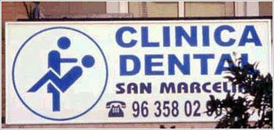
this logo is bad for obvious reasons. The image of a dentist and his patient looks more sexual than professional
bad logo 2

This logo is bad because it is very confusing. Vertical text is always harder to work with and it seems forced in the position its in. I think it would have been easier to read above or below the image. Furthermore, this logo has a very familiar nike check through the middle. It is too similar to the nike logo and looks unoriginal.
bad logo 3

I do not like this logo because once again, i feel that it's too busy. The brush-like font is not one of my favorites, and the drop shadow behind the words combined with the stroke around the letters makes it feel too "cartoony." I personally don't think the scissors are even necessary.
bad logo 4

okay first of all....i don't like this color scheme. I think this logo does not work because the three different typefaces feel busy. I think one or two would have been enough. The three organizations written inside of the border feel forced inside if the circle. Some of the words seem to be in italic and some do not. Over all i think there is just too much going on.
bad logo 5

wow...all i can say is welcome to cornytown. lol an engine with a face? how corny is that?
good logo 1

i think baby phat is a great logo. The cat sybol has become very iconic and can stand alone without the text and people still know what it represents. The simple, elegant, and sexy design is a perfect representation of the company. This logo is so popular that i have actually seen people with tattoos of it. Less is always more when it comes to logo design.
good logo 2

i think the gucci logo is great because it is also iconic. It can stand alone as a symbol or with the actual name. very simple and elegant.
good logo 3
i know this is a pretty common logo, but i think everyone can agree that apple has one of the best logos in the world. Their logo is very iconic an easily recognizable. Furthermore Apple's package design is just awesome. Their apple logo has gone through some revision over time, and i really think that now it's the best it could ever be.
good logo 4
I think bellsouth has a very sucsessful logo. The bell can stand by itself with out the name of the company. Very simple and straight forward.
good logo 5
i love MTV's logo. I think it captures both the professional and raw, unscripted footage that is shown on the channel. I also think this logo depicts the energy of the channel.
PROJECT 1 part 1

this is one part of an ad project i did in my first graphic design class. The assignment was to find different elements from magazines, cut them out, and arrange them in photoshop to create an ad. None of the elements of these projects go together. The project was only about composition, unity, and colors scheme. There are three parts to this project b/c i had to create three different size ads that all went together.
PROJECT 1 part 2

PROJECT 1 part 3

PAST DRAWINGS

all i can say is anyone who's ever taken paul rodecker's class will know what this is...intercross is a pain in the you know what! lol but i does help you to understand form better when you draw. It teaches you perspective and that objects are not always shaped the way you may think they are
PROJECT 2

this is a book cover i designed for the novel ROOTS by Alex Haley. The assignment was to choose a classic novel and re-do the cover. The photography on the cover is all original. This cover went through many revisions b/c i had a hard time staying away from typical images of slavery, (which is what the novel is about). The final product is what i feel is a more modern approach to images of slavery.
PROJECT 3-personal logo

this is a design of my personal logo. The colors in this project are incorrect on the screen. The top one is in black and white and the bottom two are in color. The color version is supposed to be black and lime green, not this funny blue color that appears on screen. The logo is obviously my initials, which are b, a. When designing this logo i was trying to go for a simple, sleek look that would look like a logo you'd see in fashion. Perhaps on sunglasses or purses. I wanted to keep it simple so that it could be easily recognizable. However, i feel that i could push this logo a little further. I plan to redo it for my portfolio in the near future.
PROJECT 4-package design

For this project i had to redesign an existing hardware package. I choose a package of craftsman heavy duty staples. The original package is hideous! I will try to post a picture of it as soon as i can find the usb cord to my camera. lol The original package had a harsh black and red color scheme, the craftsman logo was in an ugly blocky text, and it just didnt seem like an appealing package design to me. I wanted to turn it into something that would stand out in a hardware store....something more unexpected. I wanted to simplify the design and make it more easy to read. Furthermore, i wanted to make it more gender friendly (if thats even a word) lol. As a woman, i personally feel that hardware packaging is made to appeal to "manly men" who could care less about design. I wanted to also make the package appeal to women, because hey, we women like to fix things too! lol

this is a self portrait of my eye. I did a very close up study of it and i used lines to show value and form.

this is a self portrait. i really wanted to study the form of my face, the way the bones are structured ect.

this is another self portrait. I dont think it looks exactly like me but i still think its pretty cool.

this is a charcoal drawing of a still life. i love the values that you get when using charcoal.

this is another charcoal drawing of a still life.

this is a self portrait. This is the one i feel looks the most like me...except i promise i dont look this evil everyday. lol

this is a study of texture. i literally went through buildings at my school and rubbed charcoal and paper against all types of surfaces.
